Puespoek Energy
Re-Branding and Website for the Püspök Energy Group.

Project Brief
Püspök stands as Austria's largest wind power provider, rooted in a family legacy. After exploring the company's history and commitment to community, we crafted a brand message that positions Püspök as forward-thinking—reviving its traditional family image while embracing values of quality, precision, and a friendly approach.
The Outcome
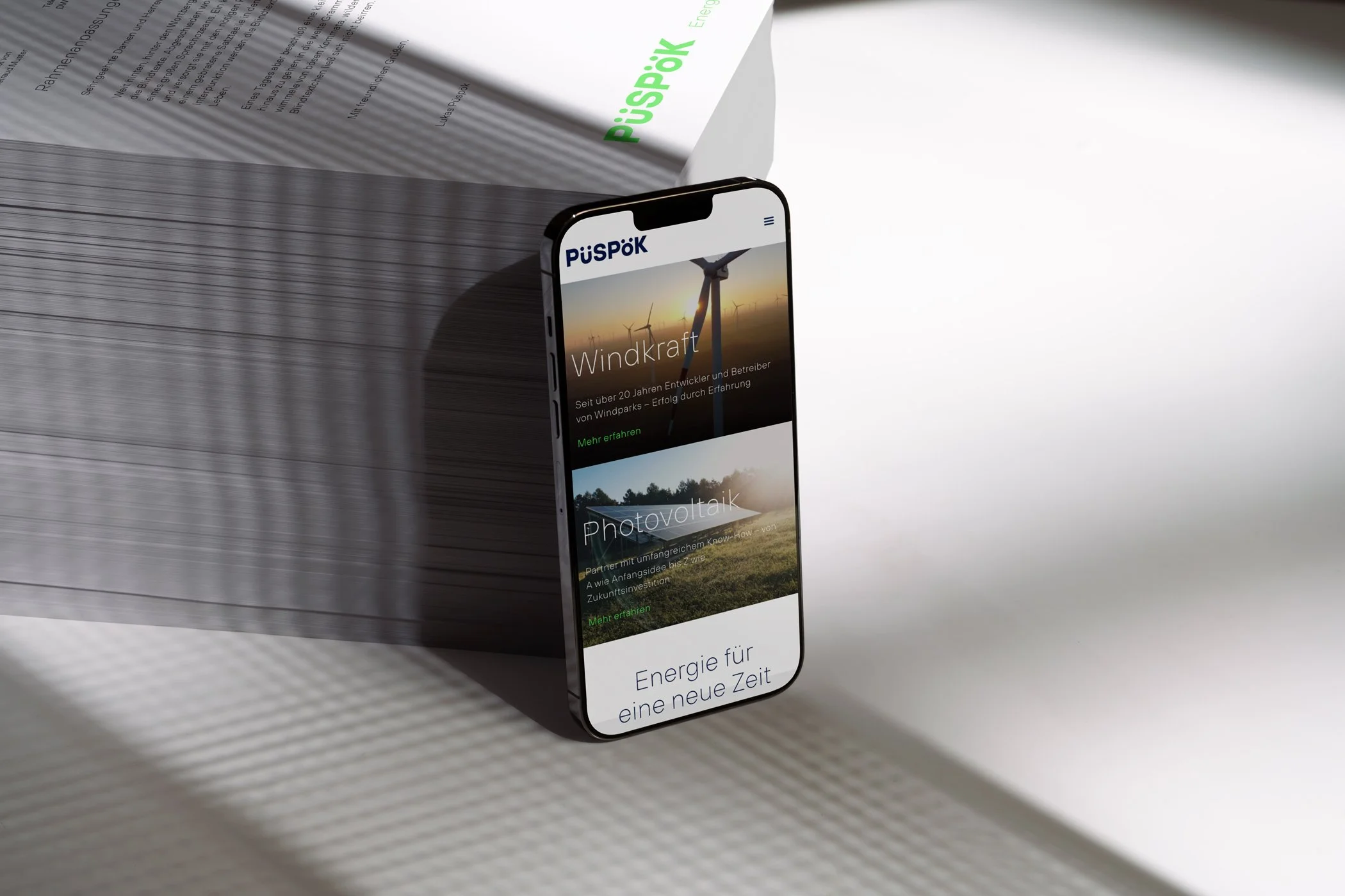
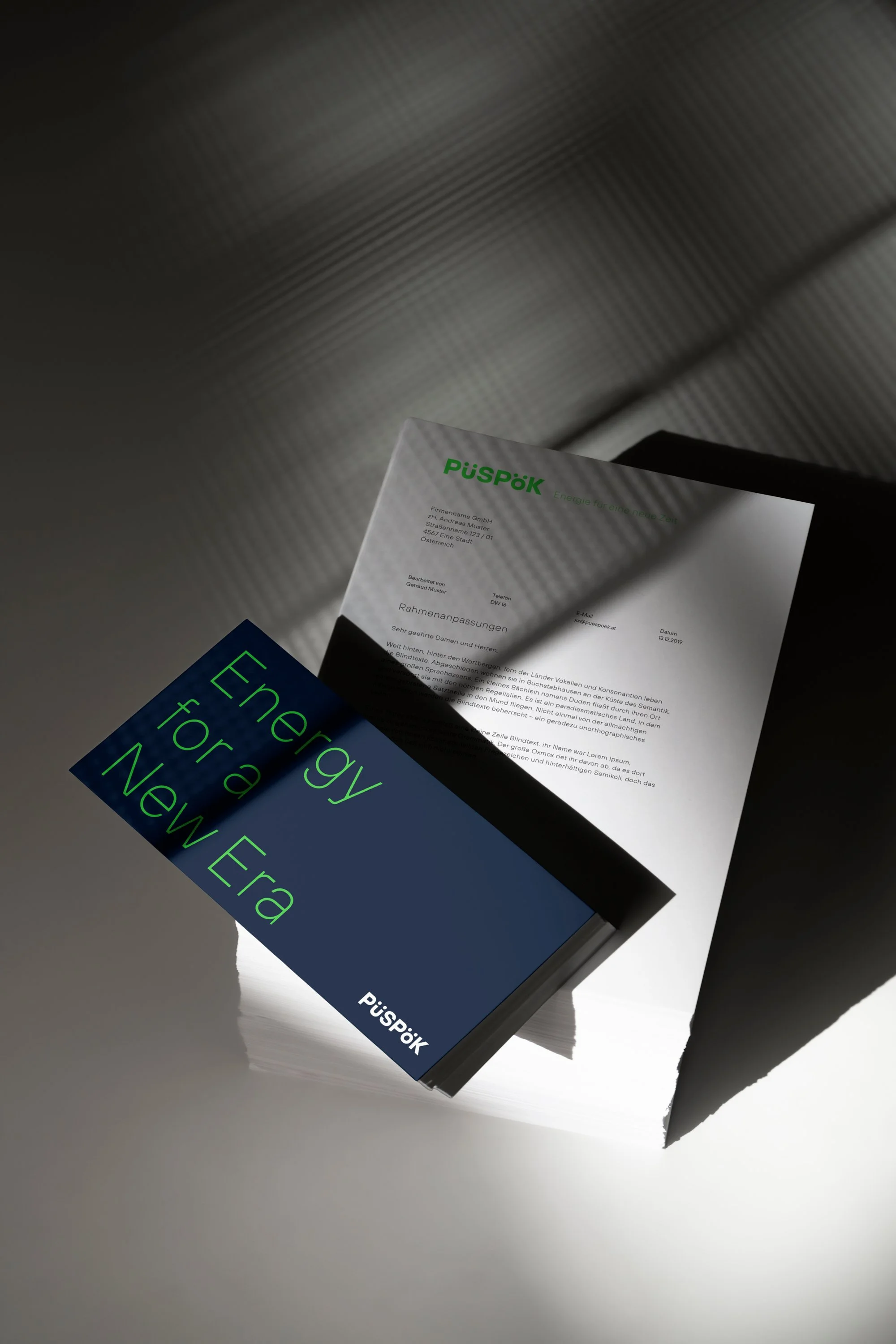
"Energy for a new Era" is one of the taglines describing the future thinking, innovative direction they are going.
The Corporate Idenity got a redesign. Püspök Group was reduized to Püspök, but keeping the ö and ü, as a quote to the traditional history of the name. The logo is bolder, stronger and more confident.
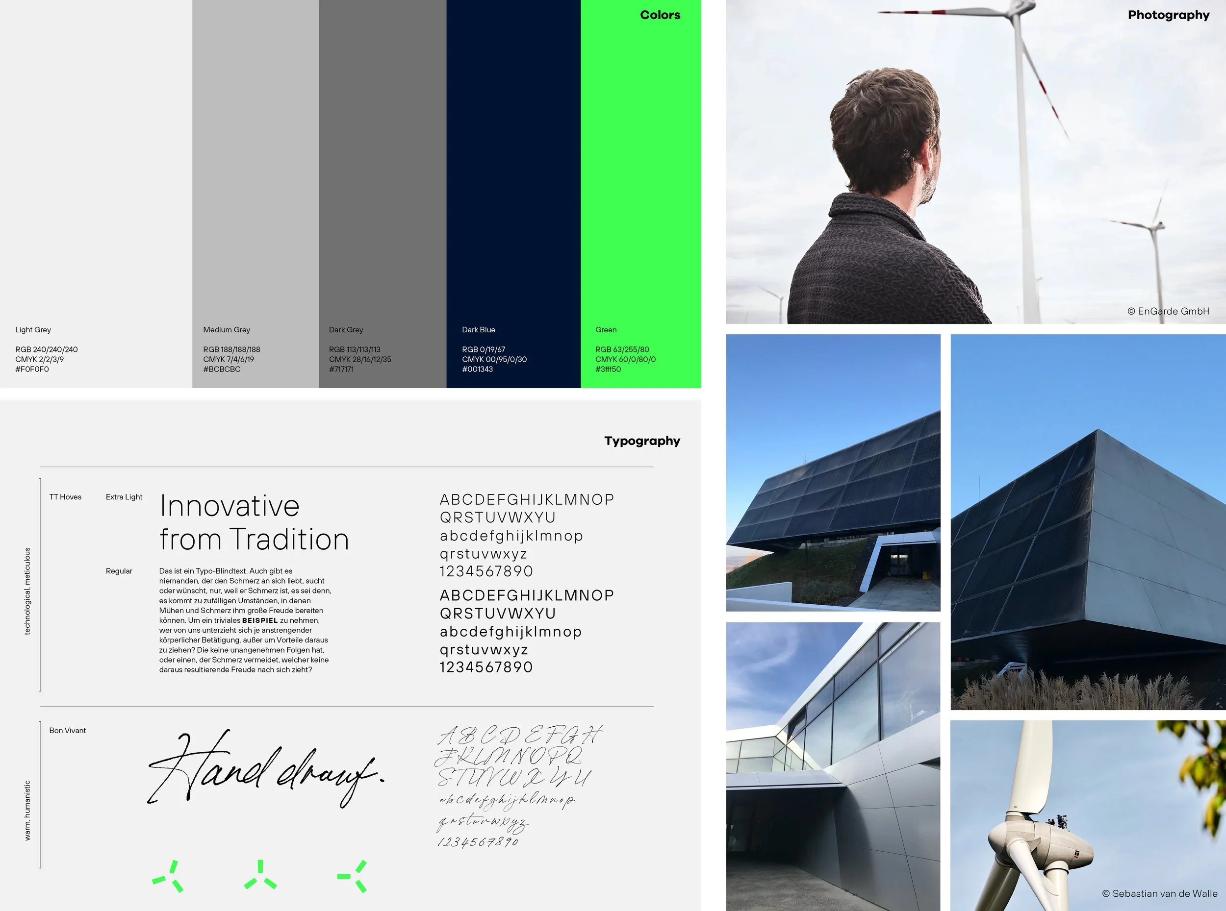
The color palette got a refresh, the dark rich blue gets complimented by a striking neon green, bringing in the innovative character of the Brand Design, accompanied by a grey colorscale for neutrality and sincerity.
As the Art Director my role not only involved redesigning the logo but also crafting web design + development at the agency EnGarde in Austria, Vienna.
Services:
Brand Strategy
Brand Design
Corporate Identity
Tagline Creation
Website Design


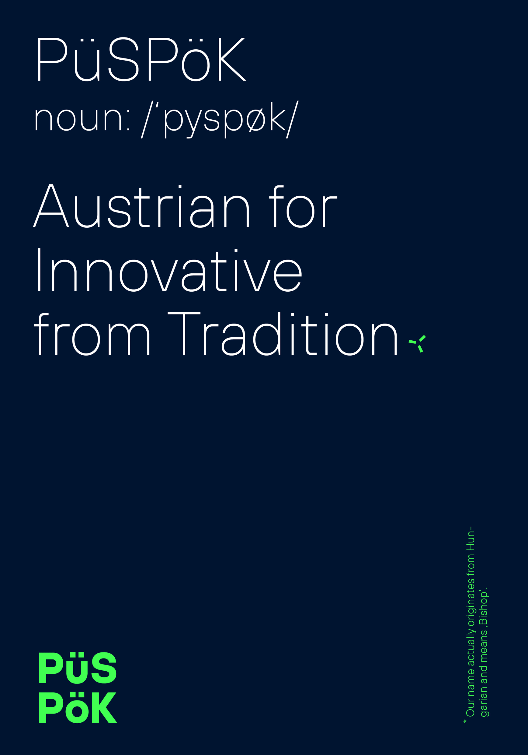
To play with the challenging name "Püspök," I introduced a fun idea. In a poster series, I assigned new meanings to the name: "Püspök, Austrian for Innovative from Tradition," "Success through Experience," and "Together for a Better Future." These phrases added depth to the name's complexity.


„Working with Coco on our Rebranding was a great experience. She understood our needs very well and transformed our ideas into visual concepts perfectly. During the whole process she was always very professional and fun to work with at the same time and she delivered results on time.“
Lukas Püspök
CEO Püspök GmbH
Other Projects


Heart-centered, strategic design for people that have a story to tell.